Last Updated on July 20, 2020 by Carolyn McRae
You have a contact form on your website. 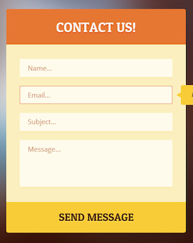
There may even be link to it from your blog and email signature.
“Schedule a call”
“Contact Us”
“Book an Appointment”
“Get a Free Consultation”
It helps you start a real conversation with web visitors, automate the process of setting up meetings, and proactively offer support to clients and prospects who feel like they want to connect.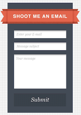
But the inquiries come in small volume.
This is weird to you. You’re offering a simple way for people to connect with you – for free! Why aren’t requests swarming in?
It could be one (or more) of three things:
– Your website traffic is small.
– Your brand isn’t intriguing enough.
– Your form could use some help.
If you need more traffic to your website, go tackle that first – Google search “increase my organic traffic” for traffic that’s truly/organically relevant to your services. If you want help refining your online brand and making your marketing more intriguing, read this guide.
For the sake of providing actionable help in this one article, we’ll focus on the form.
7 Tips to Increase Your Form Submissions
I’ve seen hundreds of advisor websites and, unfortunately, only a handful of strong “contact me” or “get a free consultation” forms.
Online forms are easy to get right, and even easier to get wrong. The good news is this could be some low-hanging fruit to improve conversion performance your website.
To help you improve your contact form, we’ll run through crucial lessons, to-do’s and common pitfalls. If you’d like walk through some of this (versus run, like I’m about to), let’s chat in the Comments below.
#1) Give them something they actually want.
Information is currency online. “Give me your info, and I’ll give you X.”
Name, email, phone number, etc are called ‘personal information’ for a reason. They’re personal. People don’t give this information just anyone. To get people to fill out your form, the benefits of providing their information must outweigh the cost of providing it.
The cost of providing their information is two fold: trust and time.
They pay the risk of trusting you to not mistreat their information, and
then spend time filling it out.
Make sure what they ‘get’ is valuable to them. Then make details of what they’ll get incredibly clear. i.e. Fill out this form and I will send you the answer in a direct email within 4 hours.
#2) Understand what YOU want and don’t be greedy.
Notice this comes second? Put their wants/needs before yours.
Your form needs to be appropriate for it’s purpose. Know what you want to achieve from each form on your website and leave out unnecessary complications.
i.e. If you want them to subscribe to your blog, don’t ask for a phone number. Heck, you don’t need their last name either, so don’t ask. (This is what we do here on the Blueleaf Blog and it works well.)
#3) Channel Goldie Locks when adding form fields.
This rule is crucial to establishing balance between #1 and #2.
You’re giving them something they want, and getting something you want in return.
But if you default to asking for as little as possible (as a way to drive down the ‘cost’ to them), your form’s performance could suffer.
Why? It comes back to “information is currency online”. When you drive down the cost, you also drive down the perceived value of what they ‘get’. Think about it. If I held up a pair of sunglasses and told you they were $5, your perception of their quality would be less than if I said they were $50.
Don’t skimp on fields just to drive down the cost. The balance needs to be juuuust right.
#4) Give your form a sidekick.
Not everyone who visits your website wants to submit a form. Provide an email address or phone number on the same page so you don’t lose the people who shy away from submitting forms.
#5) Don’t push their button with your button.
Most of the forms I see use a “Submit” button.
Excuse me while I fall asleep.
……………
………………
…………………
Ok I’m back. Seriously, the “Submit” button is so standard. It’s uninspiring. Who’s excited to click a button that says “Submit”? Plus, it tends to remind people they’re performing a transaction with a computer instead of a human.
Depending on the nature of your form, try something more conversational like “Schedule Now” or “Get the Ebook” or “Say Hello”. Regardless, a good rule of thumb is to begin the phrase with an action word.
#6) Ask for something they want to tell you.
Regardless of whether it’s particularly crucial at this stage of your contact with the person, try asking for something they want to tell you.
Think about the interactions you’ve had with people who’ve submitted your form in the past. Is there a particular detail they tend to share with you in that first conversation? Ask for this information in your form. It could be an effective way of demonstrating you understand what’s important to them. Try it out!
#7) Testing, 1, 2. Testing 1, 3. Testing 3, 4…
You should always be running an A/B test on your form. There are endless things to test and you never know what will work well. One small change can impact your conversion ten-fold.
Here are various elements you can test:
– Location of form
– Design of form
– Length of form
– Name of form
– Overall tone (professional vs. friendly)
– Field labels (think: Name, First Name, Your name, Your Name, What’s your name?)
– Order of fields
– Button phrase
– Button phrase formatting (Say Hello, Say hello, Say hello!)
– Button color
– Button size
Just be sure you only testing one element at a time (it’s called an A/B test, not an Awr/Bfz test) and bring the “winner” of that test into your next test.
Have fun! Questions are welcomed below.
Blueleaf is a financial advisor’s ultimate client engagement platform. Blueleaf equips advisors with the tools needed to keep clients informed and engaged all year long, automatically. Our intuitive client portal includes deeply embedded account aggregation, simplified performance reporting, automated client communication and sophisticated engagement tracking, document sharing and billing. Learn more or Try it free today.