Last Updated on February 28, 2023 by John Prendergast
By 2022 annual mobile app downloads are projected to reach 258 billion — a 45 percent increase from 178 billion downloads in 2017. In our last piece, we noted that pandemic-related pressure to go digital has accelerated new client expectations and behaviors for advisors and firms. Wealth management needs a new playbook for 2021, and it must include a mobile app strategy.
Technology-enabled remote and digital advice is on the rise as clients get more comfortable checking in on their finances from the comfort of their own home or on the go. This has led to fast-rising expectations around mobile, even as many advisors and firms lag behind when it comes to digital and mobile options. Clients are taking note, making it imperative that the wealth management industry as a whole begin to acknowledge the importance of mobile.
Just having a mobile app is not enough. We need Great mobile apps — apps that attract and retain clients — require beautiful and functional design that caters to the unique needs of everyone from Gen Z to grandma. The key is to find a balance between functionality and simplicity, which can be a tall order in an industry that often embraces the complex. Here are a few ways to ensure that a mobile app is above par and a reason for clients to celebrate.
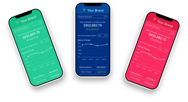
Check out MyAdvisor by Blueleaf
A powerful client mobile app with a personal touch.
Design That Works: Visually Appealing — And Functional
When asked why design is an important consideration for wealth management firms and advisors, Blueleaf CEO John Prendergast said, “I think the first thing you have got to recognize is design isn’t just how something looks, it’s how something works. It determines how you experience that thing. And because of that, it creates pain or happiness in what you’re doing.”
In other words, a beautifully-designed mobile app is functional, simple, and easy to use. This underscores the importance of finding an app with creators that have done their due diligence prior to the design stage. An app designed with a data-driven approach will be sure to look at users’ actual behavior rather than their words as a guide. Interviewing users to see what they value is a good first step, but running that against the data from actual behavior when they use the app is critical.
Another driving factor behind an app’s success with clients is whether or not the app’s creators have a point of view on what the mobile app needs to do — and whether those creators maintained focus on that purpose throughout the design process while tempering with a bias toward simplicity. A wealth management mobile app should not try to do everything for everyone. Apps that build around “shoulds” and “musts” add unnecessary complexity and become difficult and frustrating for the end user.
When evaluating apps for your firm, remember that visuals and function are tightly coupled when it comes to app design. In both cases, less is more. For example, progressive disclosure (displaying only necessary information and enabling people to ask for more information if they want) can keep the design clean and simple without overwhelming the user while still giving them everything they need.
Color
When it comes to color, there is an entire psychology behind choices and how those choices impact users. Warm colors like red and yellow can spur feelings of comfort and warmth while cooler colors like blue and green are calming. Of course, perceptions of color are subjective, but it’s good to be aware of some of the universal psychological impacts, too. For example, strict testing environments have illustrated that bright primary colors are the highest-converting colors.
Some suggest minimal color usage is ideal to preserve a positive user experience. Even with limited color usage, implementing high contrast colors in the interface can be beneficial for calls to action (CTAs) to help shift users’ attention toward the action they should take.
Type
Another point of evaluation for choosing an app is how type is used. If there’s one hard and fast rule, it’s that fonts should be larger than the average desktop email. Mobile UI should implement at least 16px paragraph font size and at least 22px font line-height. Apps with text-heavy pages should consider bumping up the size even higher.
On the other hand, interaction-heavy pages benefit from small text sizes of between 14px and 16px. In all likelihood, larger text sizes will be used for titles and other important text and smaller sizes for less important items. Forms should leverage a text input font size of at least 16px. Testing on an actual mobile device is a great way to make sure text size is not too hard on users’ eyes. The bottom line is that text needs to feel big to be comfortable on mobile devices.
Touch Targets
Touch targets, the on-screen elements that a user is meant to touch, click, or otherwise interact with, should be large enough for the user’s finger. Touch targets that are difficult to tap accurately (read: too small) can leave users feeling frustrated, leading to a negative experience. Controls should measure at least 44 points x 44 points (on iOS) so users can accurately tap them with a finger.
White Space
White space — the area between design elements — is your friend. White space includes space between characters on the screen. There are two kinds of white space: micro white space and macro white space. The former includes white space between lines and paragraphs. The latter is the larger white space between major layout elements (to the right and left of content and in between content blocks). While how you use white space will depend on your content, design, user demographics, and branding, the general rule of thumb is: more is better.
Design Impacts the Bottom Line
Choosing a well-designed mobile app can impact the bottom line — significantly. The best practices above are tried and true techniques of mobile app developers and designers that have been doing this for a while and who have collected user feedback and data. The benefits of well-designed software run the gamut, but the biggest perks for advisors are increased loyalty, reduced costs, efficiency, scalability, and enhanced competitive advantage.
Just as a poorly-designed app can ruin reputation, credibility, and loyalty, a well-designed app can have the opposite effect. A satisfying user experience reflects positively on the firm that it belongs to. When clients know they can turn to their advisor’s app to get instant and easy-to-understand information about their money, they’ll be more inclined to stick with what works. In the best cases, they may even tell their friends and family about how easy it is to keep tabs on their money, all from the convenience of their advisor’s mobile app.
A great mobile app also means that it’s easier for advisors to help clients make good decisions with their money. It reduces the costs associated with having to walk clients through a bad mobile app experience. Depending on what a mobile app does, it could also help automate some processes that normally steal time away from helping clients directly. Apps that automate reporting or communication can increase efficiency and even improve the scalability of a wealth management business.
One of the most impactful ways mobile apps aid advisors is by enhancing competitive advantage. A well-designed app that is innovative, simple, and easy to use can help an advisor or firm stand out to prospective clients while keeping current clients delighted.
If all this seems overwhelming, that’s ok. We know that most advisors are not mobile UI designers. The important thing is to understand the importance of mobile for your firm, or rather, the importance of a great mobile experience. From there, you can partner with a developer to create your own app or find a partner within the wealth management space that has already done the heavy lifting. You’ll want to stick around because we’ll be talking about a potential partner in the coming days (hint: it’s us. We just created a killer mobile app you won’t want to miss).
Engage up to 90% of your clients every single month with Blueleaf.
The all-in-one wealth management platform with best-in-class advisor and client experiences in reporting, billing, and rebalancing. Don’t wait to engage your clients, improve satisfaction and simplify your business.