Last Updated on June 18, 2021 by Carlo Navarro
If you’ve been dragging your feet when it comes to improving the customer experience in your wealth management software or mobile app, we get it. If you’ve fallen behind the curve and don’t have a mobile app to speak of yet, we get that, too.
Mobile is tricky and most advisors are hesitant to get an app due to the lackluster options available in the market. Some end up yielding to their vendor’s mobile app, which typically offers a sub-optimal experience.
We’re here to tell you there is another way.
There is a way to make your clients say “wow” and impress your clients and prospects alike with a beautifully-designed app that’s powerfully simple — and that attracts and retains clients.

Beautiful, Functional Design that Travels Well
MyAdvisor by Blueleaf — our new mobile app offering — enables you to provide your clients with an elegant experience no matter where they go. Though it will feel familiar to current Blueleaf users, the new mobile app significantly extends our leading client portal user experience to create an experience that is uniquely elegant in wealth management. Not only does it allow your clients to stay connected to their money (and you), it provides answers to their most pressing questions in an easy-to-understand way via simple-to-navigate design. The app caters to users, regardless of age, and embraces a simple, elegant design. From the clear graphics to rich colors and clear text (with good contrast), the app is incredibly easy to use.
Connected Communication and 24/7 Self-Service
The mobile app streamlines communications with clients and offers a self-service option that doesn’t require clients to be near their computers, allowing your clients to keep a finger on the pulse of their money remotely. While advisors remain in control of communication channels and can set available “meeting hours”, clients can use the app’s calendar feature to book time on their own, avoiding the inefficient back-and-forth that would happen otherwise. Clients also have the option to text or email if that is their preference, removing the burden to adhere to a communication style that they may not favor.
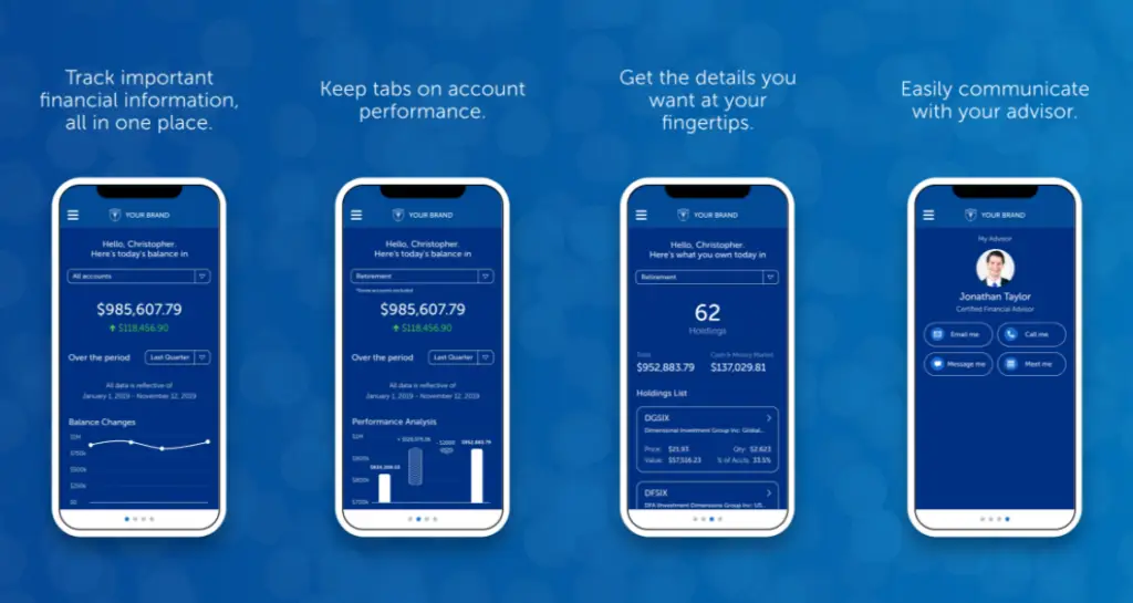
The self-service features allow clients to get answers from anywhere that is convenient for them, extending the portal service to mobile devices. Clients can quickly and easily find all of the information they need, all from the convenience of their smartphone:
- Balance Overview—Clients can quickly view their portfolio balance to understand what’s changed and why.
- Performance Details—Give clients insight into the performance of their portfolio and individual accounts over various time-periods.
- View Holdings—Show clients a breakdown of their individual investments, including held-away accounts.
Intentional Design, Features That Keep the User In Mind
The app design employs a logical flow that progressively discloses information, only revealing information as needed, in context and at the users option. We also took special care to craft information around clients’ top questions, making it easy to get straightforward, focused answers:
- How much money do I have?
- Is it more or less than last time?
- How much/how is it doing?
- What do I own?
- Where/how do I get more help?
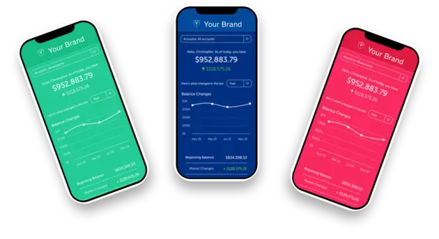
Advisors and firms can personalize the app with their own settings for contact methods, color, and branding. Even if an advisor chooses not to customize the experience, the app includes thoughtful defaults that preserve the professional appeal of the mobile experience.
Visually, the app stands out in a sea of black and white apps. Your clients will love how easy, simple, and clear it is to view balances, performance, and holdings. Large fonts, bold colors, and clear, simple graphs make it seamless for the user to quickly digest the key takeaway of the screen. This helps you to answer your clients’ most pressing questions without creating new ones.
Digestible Data and an Experience that Fosters Connection
The reigning trend in financial services software design is to offer an overwhelming array of functions. We think this is a mistake. It is just not a good experience for most users. We opted instead to reduce complexity and complications while helping your clients simplify their financial lives.
Clients can also drill down and navigate through data smoothly, viewing data for one, some, or all of their accounts quickly. Swiping and navigating through the app is a breeze as account and time period selections are set and saved for each time a user returns. Multiple, repeatable navigation options allow clients to view the data that matters most to them and return to the same screen where they left off when they close and reopen the app.
The entire experience makes advisor engagement easy and fosters a more convenient connection between you and your clients. You don’t have to be a technical wizard to make the app play nice, either. The advisor settings are simple and smart (with impressive defaults) while still keeping you in the driver’s seat. Clients can easily reach out to you in a variety of ways, both directly from the app and from their mobile devices.
We believe the ability to remotely manage client service will help pull you and your clients closer together and deepen your most important relationships. How? Through the MyAdvisor app, you now have a presence in your clients’ mobile devices and they now have access to their data whenever and wherever they may need it — along with a fast line of communication to you. This app is designed to increase regular engagement with Blueleaf and facilitate a more favorable experience for both you and your clients.
ROI-Driven Design That Makes You Look Awesome — And Different
When it comes to mobile app development, beauty is just one tenet of a great experience. A sophisticated, elegantly functional app moves the needle in the right direction in terms of ROI. MyAdvisors by Blueleaf allows advisors to turn their firm mobile, providing clients with a convenient way to get the answers they need instantly and easily, wherever they are. What’s more, it offers a branded and enjoyable mobile experience that sets you apart.
This was the impetus behind our thoughtfully-designed app that includes visually-appealing graphs and ledger formatting to help clients access a holistic view of their finances and answer their top questions. That includes meaningful insights around balances, performance, and communication options as well as any other information they may be looking for. On the communication front, we make it easy for you and your clients to talk in a way that suits you both, with easy, in-app scheduling and direct messaging. The best part? MyAdvisor is a cost-effective way to increase service and save money.
Improved Reputation & Client Loyalty
We believe a wealth management mobile app is only as good as it makes you look. We designed MyAdvisor to help you show your clients the full scale of your value, including your ability to be responsive to their needs. With information available at their fingertips and a variety of convenient communication options, it’s a no-brainer for clients to continue doing business with you — and for your prospects to choose you over competitors.
Retention extends beyond clients, so our mobile app also allows you to modernize your firm and stay competitive in recruiting advisors. It’s a win-win: you attract and retain top talent and your advisors get the technology and quality experience they expect. Our communications options also extend to your team of advisors, helping you build and nurture those relationships seamlessly.
Support That’s a Cinch — and Saves Time
My Advisor was designed to mirror what clients already see in the Blueleaf client portal, so clients can navigate the app more intuitively and without an unnecessary time-intensive commitment from the advisor for onboarding. Other mobile apps cannot say the same and often require extensive time to onboard a client to another confusing application. MyAdvisor by Blueleaf eliminates time spent answering questions like “what affected balance,” as that information is clearly outlined within the app. That means you have more time to address more substantial questions from clients, or just check in to nurture and grow the relationship.
At Blueleaf, we know that supporting a mobile app has unique considerations, so our experts are here to make things as easy as possible for you and your clients. From branding and setup to onboarding and ongoing technical support, we’re here to help.
We’ll help you choose and define your logo and color choices as well as client communication options. Our special onboarding team will help you and your clients navigate the app stores and set up your mobile account via unique email templates and client materials to get your clients using your app in no time. Nothing stays the same forever, so we also offer ongoing technical support to assist when your client needs to change devices — and as the mobile landscape evolves. When you and your clients have questions, we’re just a phone call away.
