Last Updated on July 20, 2020 by John Prendergast
Advisors aren’t designers (well, most aren’t).
Yet some have joked with me that you kinda sorta wish you were.
It’d be awesome to whip up a snazzy image for your website or format the content of your emails in a visually appealing way.
After all, bad design isn’t just embarrassing, it’s sending the wrong messages to prospects and clients. When someone looks at your stuff online, visual design has a huge impact on their impression of how you are as an advisor. If that impression is bad, they hesitate.

Here are 4 common places a financial advisor’s presence is uglier than it needs to be, what this bad design really says to people, and exactly how to give yourself a makeover. (Spring cleaning, anyone?)
Cluttered Homepage.
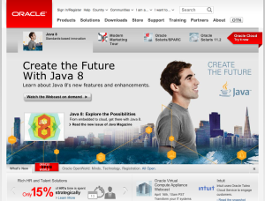
Your website (homepage, in particular) is cluttered.
What this says to people:
You’re not organized.
Your thoughts are jumbled.
Communicating with you may be overwhelming.
I don’t know what you want me to do.
Fix it: Learn from other great sites and apply what they do well to your site. Some strong advisor examples are Blueleaf users: Jason Wenk, Dave Grant, and Alan Moore.
Email Signature circa 1999.

Your email signature is stuck in 1999. It lists all your credentials, notes your fax number, and has a 8-line disclaimer at the end to put the nail in the coffin.
What this says to people:
You are stuck in 1999.
You’re behind on current times.
You’re slow to make change in your business.
Working with you will be old-school and standard.
Fix it: Read my previous post with 6 Tips for an Email Signature Your Clients Will Love
Ghetto Fabulous Profile Background
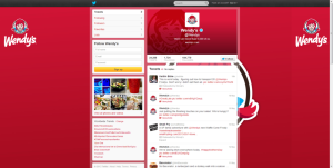
Your social media profiles are designed in a way that a 14 year-old in PowerPoint could have done. It was made, and you deemed it “good enough”.
What this says to people:
You hack stuff together.
You don’t check your work once it’s done.
Your business isn’t established enough to care about design yet.
You don’t have resources needed for basic aesthetic presentation.
Fix it: Go back to the platform’s preset design options. This is a quick and easy way to fix a ghetto fabulous attempt at fancy design work that’s not doing you any good anyway. Then take some time to do a bit of how-to research, and carefully design something that fits the platform, fits your brand, and fits your goals.
for Twitter: Settings > Design > Pick a premade theme
for Facebook: hover over your Cover Photo > click ‘Change Cover’ > Remove
for your blog: varies per platform – we suggest asking Google.
*Our unofficial award for ‘Smart Twitter Profile Design’ goes to @LHPro_Annuities today for their clean and simple design that accommodates all screen sizes and seamlessly flows into the look-and-feel their main site. Bravo!
Complicated Performance Reports
Your online performance reporting platform is any (or all) of: Cluttered. Stuck in 1999. Ghetto fabulous.
It’s complicated to navigate. It’s complicated to understand. There are complicated charts and graphs, numbers and percentages, jargon everywhere. Beta, alpha, it’s literally Greek.
Plus, it’s clunky, which says nothing about how you really help clients feel comforted and in control of their financial lives.
What this says to people:
It’s difficult to work with you.
Information I will get from you is unclear.
I’m not sure how we’re really doing.
You don’t understand what I want or need from you as my trusted advisor.
Fix it: Check out the Blueleaf client engagement platform.
 We’ve put serious amounts of research into developing a tool clients love – showing them exactly what they want to know, in a way they understand, in a format they intuitively navigate, using the kinds of words they use to talk about money. And it’s all automated for the advisor.
To check it out firsthand, take a tour with our demo videos or use a free trial to test it out in the real world.